Wednesday, 8 December 2010

Tuesday, 7 December 2010
1. In what ways does your media product use, develop or challenge forms and conventions of real media products
Documentary Commentary
Dvd commentary- Script
We decided to use the song teenage kicks by the undertones as it would successfully represent teenagers and also in our target audience it would remind them of their teenager years
We used black and white coloured pictures to show the way teenagers have changed dramatically in the past 50 years
We interviewed Mr Jeff Hughes as he is a highschool headteacher and so deals with teenagers every day we decided to use relevant cutaways during his interview to break it up a bit and keep the audience interested
We then interviewed Mr Ron Stromberg a parent of teenagers on his opinions of teenage violence
We decide to use cutaways of teenagers as they would relate to our documentaryWe then used a series of cutaways and footage of the Millbank riots to show how the media portray teenagers and how this effects the overall impression of teenagers in general
We then cut to our voxpops as we find it important that the public should be able to have their say on topics such as this.We then cut to images of teenagers as we were presenting important information in our voice over about the statistics of teenage antisocial behaviour
We then cut back to Mr Stromberg to get a parents view on if there is more teenage violence than in the past when he was a teenager an how the influence of weapons has changed the outcome of teenage fights
We then cut to Mr Hughes as his opinion is a complete contrast to that of Mr Stromberg
We cut to Miss Emily Patterson to get a teenage perspective
Then we cut to Mrs Margaret Marshall to get a grandparents view
Followed by Mr Steve Patterson to get another pa
rents perspective on what could be done to stop teenage violence
We used a clip of Worlds Strictest Parents to show how teenagers are stereotyped as drunk louts which are irresponsible and only care about getting drunk playing games and having sex
We then cut back to Mrs Marshall to ask her what she thinks teenage violence is caused by and how this effects her, we used cutaways to further te point of teenage violence
We then asked Ms Susan Ashurst a teacher at a local highschool on her opinions of teenage violence and how teenagers act whilst in school we used relevant cutaways to break the interview up as it might have been t
oo long to some members of our target audience
We then used a clip of Kidulthood a fictional account of teenage behaviour which brands itself to be as close to real life as is possible.
We then asked Mr Andrew Marshall on his views of teenage stereotyping and teenage violence
We finally asked Mr Patterson on how teenagers could improve their stereotyped image to one of a better nature
*Unfortunately blogger and Youtube do not accept WAV. files, I am currently working to convert my commentary audio into another format to upload*
My media product conforms to the basic conventions of a real media product as it uses cutaways to further points made by the interviewee as was the issue of framing and making sure the shot looked professional in the time allotted to it, we looked at many documentaries to study their various framing techniques and what would look best in our documentary, we found that a majority of documentaries film the interviewee a quarter of the way into the frame with their head three quarters of the way up the frame to ensure that the audience are watching the interviewee and there is nothing distracting them.
We found from our target audience research that our audience’s favourite colour was red so we used red in our titles to relate to
We found from our target audience research that our audience’s favourite colour was red so we used red in our titles to relate to
this, we did this to ensure that the target audience would enjoy the documentary as there is nothing worse than the target audience being dissatisfiesd with the end product.
We also left space for introduction titles to be inserted so that our audience would be able to identify with the interviewee. We also used a majority of plain backgrounds so that our interviewees would be the main focus of the documentary rather than the images and shapes in the background.
We also left space for introduction titles to be inserted so that our audience would be able to identify with the interviewee. We also used a majority of plain backgrounds so that our interviewees would be the main focus of the documentary rather than the images and shapes in the background.
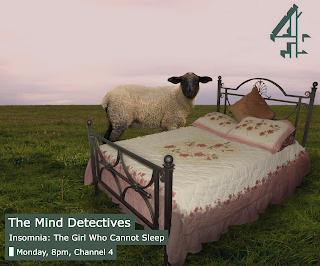
This documentary advert follows the basic codes and conventions of a channel 4 documentary advert as it used
A Channel 4 logo
A photo-shopped relevant image
All documentary information is in a box
All information is relevant
Our documentary also follows these codes and conventions as it also has
A Channel 4 logo
A photo-shopped image that is relevant to the topic of the documentary
Documentary information is in a box
Documentary information is relevant to the audience
2. How effective is the combination of your main product and ancillary texts?
Throughout the production of our documentary, radio advert and newspaper advert we wanted the theme to be constant and identical, we achieved this by using extracts from our documentary in the radio advert and also using the same person as in the voice over to voice our radio advert. We also used the same slogan in our newspaper advert as in the radio advert to ensure consistency and therefore linking back to the same themes. We also decided that following the same information would help us too so both the radio and print advert have the name, time, date and channel of the documentary made known blatantly by putting it at the end of the advert for maximum attention and also in a prominent place on the print advert to make it more noticeable.
4. How did you use media technologies in the construction and research, planning and evaluation stages?
We used a lot of media technologies during the research and planning stages of our documentary as we used Microsoft Word to create a questionnaire to ask our target audience their views on issues such as has teenage violence risen recently and is this influenced by the media, we also used this to create a list of Vox-Pop questions. We also used pie charts to explain our findings in a way that is both informative but easy to view. The internet also was a major part of our research as we searched for articles about the issue of teenage violence and teenage drinking; we also used the internet to collect images for cutaways such as teenagers drinking alcohol and passed out on the floor to further the arguments.
The construction of our documentary was fairly technical too as we used editing software, photo editing software and a DV camera, tripod and clip on microphone. We used Adobe Premier to create and edit our 5 minute documentary on teenagers through the years, we also used the same software to create our radio advert, we were not entirely familiar with the software used and so had a few problems filming vox pops as our microphone stopped working so some of our vox pops were considered useless and so we had to refilm some of them. We had no problems in the latter stages of filming which was fortunate as if we had lost an interview we would have had difficulty trying to refilm it. We used photo editing software to create our poster for the documentary as it created a more professional flawless look, we were not used to using this software so many things on our poster had to be redone as we familiarised ourselves with the programme.
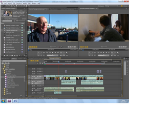
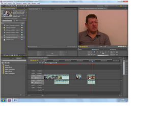
The editing process contained a lot of technology as we used Adobe Premier; we used a lot of the features in this programme to enhance our documentary to the best of our abilities. We used a basic drag and drop to move our film clips onto the editing box to choose the segments we wanted to use and the segments we could delete such as the interviewer reading the questions out or when the interviewee was looking at the camera or other things which would not be suitable to use in the documentary. We used the cut tool to shorten clips and to make the cuts smoother, we also inserted archive footage and images from elsewhere by using the import tool, we also used graphics to explain to the audience who the interviewee was and how old they were in some cases and if they were a parent or grandparent so that the audience would recognise that the person had experience both as a teenager and in some cases in bringing teenagers up. I found adding graphics easy to do but at the same time complicated as the components of the colours must be a set number and the position and size of the graphics must also be a constant as if the graphic is to large and is positioned in a corner when another one is small and in the centre it makes the documentary look less professional in shabby. The creation of the radio advert was a lot easier as we took sound from the archive footage of our documentary and changed the sound levels to make the advert sound better. We used Photoshop to create our documentary poster, this was slightly difficult as we had little to no experience with this software and did not know how to use it to the best of its abilities and so we kept re-doing a lot of our elements for the poster so that they were done properly

The construction of our documentary was fairly technical too as we used editing software, photo editing software and a DV camera, tripod and clip on microphone. We used Adobe Premier to create and edit our 5 minute documentary on teenagers through the years, we also used the same software to create our radio advert, we were not entirely familiar with the software used and so had a few problems filming vox pops as our microphone stopped working so some of our vox pops were considered useless and so we had to refilm some of them. We had no problems in the latter stages of filming which was fortunate as if we had lost an interview we would have had difficulty trying to refilm it. We used photo editing software to create our poster for the documentary as it created a more professional flawless look, we were not used to using this software so many things on our poster had to be redone as we familiarised ourselves with the programme.
The editing process contained a lot of technology as we used Adobe Premier; we used a lot of the features in this programme to enhance our documentary to the best of our abilities. We used a basic drag and drop to move our film clips onto the editing box to choose the segments we wanted to use and the segments we could delete such as the interviewer reading the questions out or when the interviewee was looking at the camera or other things which would not be suitable to use in the documentary. We used the cut tool to shorten clips and to make the cuts smoother, we also inserted archive footage and images from elsewhere by using the import tool, we also used graphics to explain to the audience who the interviewee was and how old they were in some cases and if they were a parent or grandparent so that the audience would recognise that the person had experience both as a teenager and in some cases in bringing teenagers up. I found adding graphics easy to do but at the same time complicated as the components of the colours must be a set number and the position and size of the graphics must also be a constant as if the graphic is to large and is positioned in a corner when another one is small and in the centre it makes the documentary look less professional in shabby. The creation of the radio advert was a lot easier as we took sound from the archive footage of our documentary and changed the sound levels to make the advert sound better. We used Photoshop to create our documentary poster, this was slightly difficult as we had little to no experience with this software and did not know how to use it to the best of its abilities and so we kept re-doing a lot of our elements for the poster so that they were done properly


Monday, 6 December 2010
Audience Feedback
To get audience feedback we asked our target audience to complete the following questionnnaire and help us realise what was good bad and where we could improve.
Audience Feedback Questionnaire
1.) After watching our documentary, do you feel like anything could be Improved?
2.) If so what would they be and why?
3.) What aspects of our documentary were good and bad?
4.) Was the music chosen appropriately to suit the style?
5.) Does our documentary challenge the codes and conventions of a documentary?
1.) Does our print advert for our documentary advertise our product well?
2.) If so what do you like? also what could be improved upon?
3.) Does it stand out amongst real print adverts?
4.) Does it appeal to you?
5.) Does it work well with our documentary as a package?
1.) Does it advertise our product well?
2.) If not what could be improved and why?
3.) Was everything in the radio advert relevant?
4.) As a whole was the radio, documentary and print advert packaged well?
5.) What did you like about it/dislike and why?
We found that a majority of our target audience found that some of the interviews were a bit long and could be improved by having the responses shortened a bit and made more to the point. They also said that the balance between adult and teenager was a good concept but that there was a majority of adults interviewed and so this made the documentary slightly biased. According to them the music was good but more recent music could have been used to make it appeal to teenagers more. We found that they tought our documentary conformed tom a majority of documentary codes and conventions and that it worked well.
The target audience thought the concept of using four faces to create one teenage face was very good and worked very well to advertise our documentary, they thought the use of a red font was good as it was what we found to be the target audiences most prefered colour. However they claimed that it did not stand out but fitted in with most channel 4 documentary posters. A majority of the target audience stated that the poster did appeal to them and that they would watch the documentary as the poster and documentary worked well together.
The target audience felt that our radio advert worked well to advertise the documentary but that the voice over artist sounded bored and rushed in places, however they did also say that everything said in the advert was relevant and all linked back to the documentary and its content. They thought that the radio advert, print advert and documentary was packaged very well and everything was very closely linked. A majority of our target audience thought that music could have been added to make the advert sound more exciting and grab the audiences attention.
Newspaper and Radio
Our Documentary Poster


Codes & Conventions Of A Newspaper Advert
- Logo
- Schedule
- Image relating to the documentary
- Website
- Date and time
- Simplified images
- Colour Schemes
- Items located to the bottom of the advert
- Logo usually located to the bottom right
- Photoshopped images to enhance and make changes to imagery
Creating our Newspaper Advert
We looked at other newspaper adverts to get a sense of what was expected of us, from this we identified the codes and conventions shown above. We debated some ideas within the group and looked at the type of newspaper it would be advertised in as this would affect the elements of our documentary immensely, we also looked closely at the codesand conventions and decided which ones we should conform to to enhance our advert.
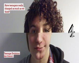
We decided to use four images of teenagers and cut certain aspects out of the pictures to mould together to create a typical teenager thus posing the question are all teenagers the same despite their different stereotypes, looks and ethnicity. We also used simple fonts and colours to accompany the image to tie the advert together and make it look professional.
Codes & Conventions Of A Radio Advert
- Extracts from your documentary
- Opening with a voice over explaining and introducing the topic
- Sometimes can ask a question
- Ident at the end of the advert
- Usually last no longer than thirty seconds
- Subtle but effective music bed
Radio Advert Script.
Sex, drugs, games and alcohol, all in a typical teenage day, but are all teenagers like this?
[extract from documentary-My lifestyle is playing Xbox, getting hammered and having sex] Teenage Evolution is going to find out if teenagers are all that the media says they are [extract from documentary- Yeah I went to anger management...got kicked out of anger management...for being angry] do teenagers need to grow up, or do they have too much too young? you decide, Teenage Evolution, Channel 4, 9:00, Friday.

Examples of Other Documentary Posters


Codes & Conventions Of A Newspaper Advert
- Logo
- Schedule
- Image relating to the documentary
- Website
- Date and time
- Simplified images
- Colour Schemes
- Items located to the bottom of the advert
- Logo usually located to the bottom right
- Photoshopped images to enhance and make changes to imagery
Creating our Newspaper Advert
We looked at other newspaper adverts to get a sense of what was expected of us, from this we identified the codes and conventions shown above. We debated some ideas within the group and looked at the type of newspaper it would be advertised in as this would affect the elements of our documentary immensely, we also looked closely at the codesand conventions and decided which ones we should conform to to enhance our advert.
We decided to use four images of teenagers and cut certain aspects out of the pictures to mould together to create a typical teenager thus posing the question are all teenagers the same despite their different stereotypes, looks and ethnicity. We also used simple fonts and colours to accompany the image to tie the advert together and make it look professional.
Codes & Conventions Of A Radio Advert
- Extracts from your documentary
- Opening with a voice over explaining and introducing the topic
- Sometimes can ask a question
- Ident at the end of the advert
- Usually last no longer than thirty seconds
- Subtle but effective music bed
Radio Advert Script.
Sex, drugs, games and alcohol, all in a typical teenage day, but are all teenagers like this?
[extract from documentary-My lifestyle is playing Xbox, getting hammered and having sex] Teenage Evolution is going to find out if teenagers are all that the media says they are [extract from documentary- Yeah I went to anger management...got kicked out of anger management...for being angry] do teenagers need to grow up, or do they have too much too young? you decide, Teenage Evolution, Channel 4, 9:00, Friday.
Subscribe to:
Posts (Atom)